Heat Maps for Google Maps - (a.k.a GeoIQ mashup)
location based services
So it has been a while since we posted, but the rationale was we’d wait till we had a working example of moving past push pins. This week we got our GeoIQ API working with the Google Maps API and have the first set of screen shots to show. One of the things we thought is really missing from web mapping applications, right now, is the ability to do geographic analysis. Even the ability to make basic decisions like - is location “A” better than location “B” is missing. With this first simple idea in mind we’ve built a quick mashup with Google Maps. We took our heat mapping API and integrated it with a split screen Google Maps viewer. That way you can look at two locations at the same time and compare them.
We wanted a fun data set to play around with and thought traffic congestion/delay would be interesting. The Bureau of Transportation Statistics (BTS) has a cool data set with average traffic delay for all the US highways available, so we threw that in. One of the problems with pushpins or polylines in Google Maps (and others) is there is no way to visualize what are the high value or low value pushpins. In this case, which road has high traffic delay and which roads have low traffic delay. We do this with a heat map (similar to Zillow, Google Adsense, etc.) that can be dynamically refactored as you zoom in/out (see previous post). We added to this heat map tool a concentration index - which gives you a score of the value (weight) of your pushpins and how closely they are located together. Once you have the score you can see if location “A” is better than location “B”. In this case is traffic delay more concentrated in location “A” or location “B”
A comparison of the concentration of traffic delay in San Francisco and Los Angeles
The GeoIQ API creates a heat map based on an index that measures the amount of traffic delay on the roads and how closely that road delay is located to other delayed roads. The higher the delay and the closer together the roads, the hotter the map and the higher the score. The score ranges between 0 and 1. If all the traffic delay and highways were concentrated at one single location the score would 1 and if there was no traffic delay the score would be 0. In the map above traffic delay for Los Angeles in .26 and for San Francisco it is .15, so if you believe the BTS data traffic, LA is about twice as bad as SF. Lets go east coast - NYC vs. DC.
A comparison of the concentration of traffic delay in New York and Washington DC
According to this score NYC is a little worse than DC. The cool thing about the technology is you can run these comparisons on the fly as you zoom in and out of the map. So - let’s compare two big traffic bottlenecks in DC to see which is worse the I-270 Spur or I-95 Mixing Bowl.
A comparison of the concentration of traffic delay at the I-270 Spur and the I-95 mixing bowl - both in Washington DC
The Spur looks to get the better of the Mixing Bowl. In the app you can do this with any data set or mash up multiple data sets to solve a variety of problems surround location decisions. We’ll have more to come so stay tuned if this looks interesting.
Posted in Uncategorized 11 Comments »
Moving Past Push PinsJuly 20th, 2006 by seagor
After watching the Microsoft Virtual Earth spiel at their CEO summit (http://www.microsoft.com/winme/0605/27736/BillG_CEO_Summit_MBR.asx )earlier this year it reinforced that the geospatial web has still not really gotten past just putting push pins on maps. Don’t get me wrong MS, Google, and Yahoo and the various mash ups they have inspired have done some incredibly cool stuff with putting push pins on maps, but it has not yet evolved to providing true analysis of the push pins that allow users to make better decisions.
The one place where you do see analysis going on is with driving directions, but even that is really just starting to evolve past what Mapquest did years and years ago. In my mind the real contribution of the geospatial web to date has been unleashing the huge amount of geo-referencable data that has been sitting dormant. The easy to use features of Google Earth and KML really kicked it off by providing a dynamic and cool mapping widget for people to look at theirs and others data. The result was a huge number of mashups many times with data no one had seen on a map before like locations of houses for sales with pictures and prices or the location of registered sex offenders by street address.
In addition to looking at the push pins of where sex offenders are and where houses for sale are, the consumer should be able to numerically compare the concentration of sex offenders and home prices in one location versus another location. Go the next step and add in schools, test scores, and user rated Mexican restaurants. What are the locations that have the highest concentration of amenities to make a location attractive to home buyer, business location, marketing campaign, franchise expansion, warehouse etc. You could also calculate the concentration of risk to natural hazards for insurance and security uses. Once you start creating geo-analytics that are easy and intuitive to understand to non-technical users there are a whole host of questions people can start to answer with their push pins on maps.
This is where there is a considerable gulf between the geospatial web and traditional GIS. The geospatial web has made mapping technologies available to the masses but has not been able to provide analytics. Traditional GIS has a vast array of analytics but they are so arcane and technical only formally trained professional can use them. The trick is to harness the analytics of traditional GIS into the easy to use world of the geospatial web. Two big problems block the road to what seems like a straight forward trip. For one the average person has no clue what traditional GIS analytics are or how to perform them - in fact few professionals really understand the mathematics behind what is being done. The intricacies of inverses distance interpolation or Gaussian decays of kernel density functions are lost on 99% of the universe. Yet these are exactly the tools needed to answer the simple user question discussed above.
That is the first bridge to be crossed, but even if you do manage to simply the labyrinth world of map algebra, you still have severe computational limitation to surmount if you want to deliver analytics to a browser. If you have every tried to run a kernel density analysis with a decent pixel resolution across a large geography on a traditional GIS - you might as well make a coffee run because it is going to be a while before you get a pretty heat map back. This is using a desk top application, not sending it to a browser, and it is creating only one heat map (raster surface). Since Google Earth the mass users are used to getting more detail when they into an image, and they will expect the same of their analytics. Producing raster heat maps on the fly is something that even high powered desktop applications cannot achieve.
We think there are creative ways to solve these problems, and hope to start a discussion with community as we get ready to launch our approach to it. Creating and any and all feedback or ideas about how geo-analytics can be evolved to create value for the geospatial web is the goal of the blog. So join in and hopefully we’ll have something cool to show in the next month or so.
Thanks,
Sean Gorman
Posted in Uncategorized 5 Comments »
skip to main |
skip to sidebar

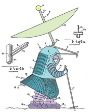
A Sextant --- solid brass navigation technology ... from 200 years ago !
The 2007 << Dream Machine >>
no doubts .. the ultimate smart phone in 2007

where it's at in 2007


... but it didn't catch on

... if you don't know where you've been - BUT - how did you GET here ?!?!
Our focus is on Location Based Services ( LBS ) which answer "Where am I? Where is it? How do I get there?" ... & Location Aware Devices (LADs) such as 3G smartphones, mobiles, cellfones, PDAs and personal wireless platforms. LADs will soon be everywhere [i.e. ubiquitous = DoCoMo]. This blog will stay on top of all things that will help us .... keep on track ... and show us where it's at
GPS SATNAV LBS "Personal Navigation Device"
A Sextant --- solid brass navigation technology ... from 200 years ago !
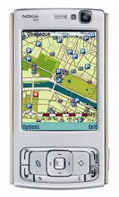
NOKIA N95
The 2007 << Dream Machine >>
OUR LOCAL TIME ( +10 hrs on Zulu)
Hobart |
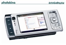
NOKIA 95
no doubts .. the ultimate smart phone in 2007
SUBSCRIBE TO THE RSS FEED HERE


YOU'RE SEARCHING FOR WHAT
NOKIA N95
where it's at in 2007
The UBIKWITUS SWICKI
where do you come from ?
Blog Archive
-
▼
2006
(2445)
-
▼
October
(132)
- WITH A CELLPHONE AS MY GUIDElocation based service...
- NAVTEQ(R) Map Data Featured on New Delphi Portable...
- The World is Watching: Image Mobile Search Gets Re...
- Wireless Beyond the Warehouselocation based servic...
- TELUS Launches Location Based Services With Openwa...
- Mobile Networks to Cover 90% of the World's Popula...
- Mobile Web 2.0location based servicesTestimonials"...
- Palm GPS Navigator Smartphone Editionlocation base...
- CLICK ON THE REAL WORLDlocation based servicesLoca...
- Motorola: It’s All About MElocation based services...
- Internet and Wireless Privacy: A Legal Guide to Gl...
- The difference (the lack of) a touch screen makesl...
- Phone creates interactive maps from snapshotslocat...
- Mobile-phone network reveals the ties that bindloc...
- The BlackBerry As An Anti-Status Symbollocation ba...
- Inrix to Provide Dynamic Fuel Price DataIn an inte...
- Feature Overload?location based servicesJust comin...
- Intelligent Spatial Technologies Deploys iPointer(...
- Tip - Location-Based social networking from NavXS ...
- The World is Watching: Image Mobile Search Gets Re...
- Market Research: Internet-Enabled Consumer Telecom...
- Autodesk and JumpTap form strategic alliance to ad...
- Nokia 330 Auto Navigation Debutslocation based ser...
- Oracle and Mapslocation based servicesCharles Babc...
- LBS Development - Determining Privacy Requirements...
- Opera Mini Available for Palm and BlackBerry Devic...
- TomTom and Vodafone Netherlands Partner on Travel ...
- Plotting Crime, Street by Streetlocation based ser...
- Study: Only 10% Of Americans With 3G Phones Use 3G...
- Geocoordinates from Wikipedia for Google Earthloca...
- Telstra 3G Network Tested To The Limitlocation bas...
- Geotagging Web Pages and RSS Feedslocation based s...
- Mobile Web Statslocation based servicesThere’s a r...
- The Value Of Customers With Demand For On-Demand M...
- Two Hundred Million A-GPS Enabled Cellphoneslocati...
- Cell Phone Takes Security to New Heightslocation b...
- Rosum Debuts TV+GPS Hybrid Positioning Modulelocat...
- Aerial imagery inspires industry location based se...
- Gold Coast Map location based servicesFind accommo...
- Recent changes to Google Maps location based servi...
- Location Based Services 2006Location Based Service...
- Mobile Users Want Navigation, Not Video location b...
- Emergency Alert For Salelocation based servicesLoc...
- Location based application. Is there a relevant fo...
- TCS' VoIP E9-1-1 Technology Assists Public Safety ...
- Navicore - World's Smallest Bluetooth GPS Receiver...
- Airis T620 and T610: GPS-PDAlocation based service...
- Casio GPR-100 GPS watchlocation based servicesWher...
- Location is Better than Mobile TVlocation based se...
- Google Maps Mania Video: Maps Mashups for Travel l...
- Overlay Mappinglocation based services¤ This page ...
- LOCAL LIVEWell this is it folksshould google be tr...
- OpenStreetMaplocation based servicesOpenStreetMap ...
- LBS World Forum: Context Matters!location based se...
- Navicore Brings GPS Navigation to Nokia 770 Intern...
- Vendors Begin To Introduce WiMax Infrastructure Ge...
- What is Navideo?location based servicesNavideo is ...
- Device helps navigate daily lifelocation based ser...
- Microsoft Streets and Trips 2007location based ser...
- activepilot 6location based servicesactivepilot 6 ...
- Aussies knuckle down ahead of Asheslocation based ...
- GPS phones are upon uslocation based servicesAustr...
- Holiday Outlook Healthy for Gadgetslocation based ...
- Boeing begins work on new GPS satelliteslocation b...
- Are we there yet? How to navigate wine trails usin...
- Galileo nav system for war?location based services...
- 5o9™ Me For Businesslocation based services5o9™ Me...
- Operators With 620 Million Subscribers Spearhead G...
- Mashups to Re-Map the Legal Tech Market?location b...
- ASK.COM mapsLocation based services
- Tele Atlas Signs Agreement with Automotive Infotai...
- 25% of WCDMA Handsets Will Include GPS by 2008loca...
- Google Maps for Mobile now runs on the Treolocatio...
- Heat Maps for Google Maps - (a.k.a GeoIQ mashup)lo...
- Scientists build better navigation aidslocation ba...
- T-Mobile to launch mixed-signal phonelocation base...
- Global Positioning in Mobile Handsets by 2008locat...
- Numerex Expands Network Capabilities With GPS and ...
- Palm and Google Bring Google Maps to Treo Smartpho...
- GPS Capability Enhanced in Microsoft Streets & Tri...
- Cellphone disables itself when its owner straysloc...
- A Frontrunner for the Coolest Google Mashup.... Ev...
- Navigation new 3G killer app, In-Stat sayslocation...
- Online map portal to launch mobile serviceslocatio...
- Verizon Wireless Customers Can Quickly Find What T...
- Microsoft and Pharos Introduce New GPS Locator for...
- Facet Technology Corp. Announces New Web Service l...
- Trimble VRS Now Service to Be Launched in Germany ...
- GPS coming to GSM handsets, analysts saylocation b...
- Mexens Technology unveils virtual GPSlocation base...
- Google Maps in the business world location based s...
- Create and share polygons and paths on Google Maps...
- Wineries with tasting roomslocation based services...
- Chicago BYOB restaurants, a map from Dr. Vinolocat...
- Your web site will need GPS facilities location ba...
- GPS mobile phone study by ABI location based servi...
- Sierra Wireless introduces ExpressCard product lin...
- First 3G HSDPA Network Launched Across Rural and U...
- Numerex Expands Network Capabilities With GPS and ...
- GPS coming to GSM handsets, analysts saylocation b...
- The Notebook Untethered: Wireless Technologies are...
- Samsung Starts Selling World's First 10 Megapixel ...
- Google Maps Creation Tools and Resources - Part 9 ...
- Mapstractionlocation based servicesMapstraction is...
- MuskokaTech’s New Version of PathAway Ideal for GP...
- OpenLS for indoor positioning : strategies for sta...
- Need Cash? Texting Service Locates ATMslocation ba...
- Lucrative store locations pinpointed by new modell...
- Location Based Services (LBS)/Geographical Informa...
- About TeleMapics, LLClocation based services TeleM...
- Canada Gets New Location-Based Services from Netwo...
- deCarta Partners With GlobeXplorer for Aerial & Sa...
- Roaming around Europe, the US or Canada, and Need ...
- Cell phone doubles as personal trainerlocation bas...
- 411 On PSP GPSlocation based servicesITmedia Games...
- 2ergo goes Directlocation based services2ergo has ...
- Yahoo! Maps Simple API location based servicesDis...
- Toys 'R' Us Names Wherifone GPS Locator Phone on I...
- New Portable GPS Navigation System Featuring Text ...
- Nokia Dials Up GPS Technology Leader Trimble for I...
- Geotagging Photoslocation based servicesNow that I...
- What is TMC Traffic?location based servicesThe TMC...
- Monday interview: mobile advertising expert Russel...
- GPS ready for its media closeuplocation based serv...
- Nokia Licenses Trimble Location-Based Patentslocat...
- WAN Card connects to EV-DO Revision A networksloca...
- SiRF GPS Guides HP iPAQ Travel Companion location ...
- Cheat Sheet: Mobile location-based servicesThey kn...
-
▼
October
(132)
EARLY SATNAV ...
... but it didn't catch on
you don't know where you going...
... if you don't know where you've been - BUT - how did you GET here ?!?!

No comments:
Post a Comment