Searching for a mobile interface
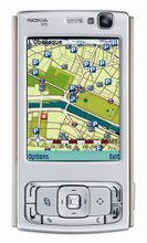
location based services
Nearly a quarter of phones returned for being faulty are working properly, a recent survey suggested. The problem is people just cannot figure out how to use them.
Handset design has changed little but supports ever more functions
As manufacturers struggle to pack in more features, mobile phone users struggle to get them to work.
"There's a common idea in psychology that users can only cope with a certain number of choices at once," explains Geoff Kendall of Next Device, "And that number is roughly seven, plus or minus two.
"So anything more than between nine or five choices then users will get confused and actually only look at the top few items anyway."
With increasing depths of lists and menus making the user experience more complex, designers are looking for ways to help users to understand what is happening on the screen. A popular solution is animation.
"Some people think animation is just for eye candy, to make things look good, but it can actually enhance usability," said Mr Kendall.
"For example, on the Apple Mac when you want to minimise a window and you click the button to do so, to take it out of the desktop and away to an icon in the corner, the window appears to be hovered away into the icon.
"On one level that's just a nice visual effect, but on another level, new users who've never clicked that button before can instantly see what's happened to that window, where it's gone. So they can instantly click back on that icon and get the window back."
Keypad design
One solution is called Ninespace, an interface in which every level of the menu is presented as an animated 3x3 grid, with each option corresponding to a number on the keypad.
Perhaps instead of trying to build a menu system around the existing keypad, maybe it is the keypad itself that needs to change.
The iPod wheel has influenced mobile handset designers
Certainly some makers have tried mixing things up a bit, with full qwerty keyboards for the serious typist, or crazy keypads for those that want to stand out from the crowd.
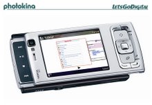
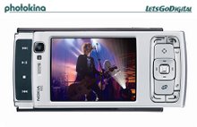
If manufacturers want to highlight the second function of a phone, for example its music playing capabilities, they can build in an extra set of controls.
When you just want to listen to tunes, swivel or slide the keypad out the way, and your phone becomes an mp3 player.
In fact it is in a digital music player that we find one of the few real breaks from the norm that really worked - the wheel that sits on the front of the iPod.
It is a user interface that dares to be different and ticks all the boxes - it looks cool, and actually makes life easier.
Whether or not Apple pinched the menu layout idea from Creative, the iPod has become an icon, its much-copied scroll wheel has become the centre of attention.
'Wheel of fortune'
Geoff Kendall believes the iPod is an example of a mobile experience that works.
"The scroll wheel gives you the same kind of dexterity as a mouse. Within second you can go from top to bottom of a list just by changing the speed your thumb rotates on the wheel.
"This is very different from an up and down cursor, when all you can do is just click through one item at a time over and over again."
I don't think the scroll wheel is the answer to all user interface problems
Geoff Kendall, Next Device
Nowadays it seems everyone wants a piece of Apple's wheel of fortune. To really make a style statement, some manufacturers seem to think your controls have to be round - some even think that you can do away with the keypad entirely.
On one new phone we tested, the scroll wheel is all you have to navigate the menus, type texts and dial numbers, which can be a bit tedious.
"The iPod scroll wheel is exceptionally good at solving one particular problem, which is navigating through menus where there might be huge long lists of options," Mr Kendall said.
"The problem we have with mobile phones, for example, is that they do much more than just show lists of albums and artists and so on - we have to take pictures, send messages, take calls etc. So I don't think the scroll wheel is the answer to all user interface problems."
Virtual controls
So the wheel is best for lists, the keypad is better for numbers, and other controls are better for other functions. How do you fit that all on a phone?
The answer may be simpler than you think. The phones of the future will perhaps sport the user interface some believe is the best set of controls ever designed - a touch sensitive LCD screen where the buttons should be.
This virtual keypad will mean that whatever mode the phone is in, you get a different set of controls.
"You don't always need or want 12 keys, you might want a scroller, or a wheel, or a joystick, or a navigator, or one key, or three keys," said Nina Warburton of Alloy Product Design.
The idea of a virtual keypad is not brand new - PDAs have been using them for a while - but some designers believe there is still room for improvement.
"Virtual keypads have been tried before and they have experienced lots of problems," said Nina Warburton.
"One of the key problems with them is that you can't feel what you're doing, you're just touching a screen."
Motion sensors
By using a finely honed vibrate function, and audible clicks, it may be possible to recreate the feel of a button being pressed, or even a slider being slid.
Other phone makers are looking at even more radical user interfaces, such as taking a leaf from the new Nintendo Wii games console's motion sensitive controllers.
We have seen footage of a Korean phone with a motion sensor, which supposedly lets you write your numbers in the air.
But for any new user interface to go from good idea to workable product, serious money needs to be invested in its development.
"Even if something is better, users can be a bit reticent about taking it up if it is unknown," said Geoff Kendall.
"I think one of the problems that we have right now is that the market is very conservative.
"Manufacturers don't want to invest a lot of money doing something brand new if users aren't going to buy it if it isn't as thin as the Motorola Razr, for example."
So the question remains - will any manufacturer be willing to take the leap of faith to a new user interface? And if they do, will these new user interfaces catch on? Only time will tell.
Subscribe to:
Post Comments (Atom)


No comments:
Post a Comment